





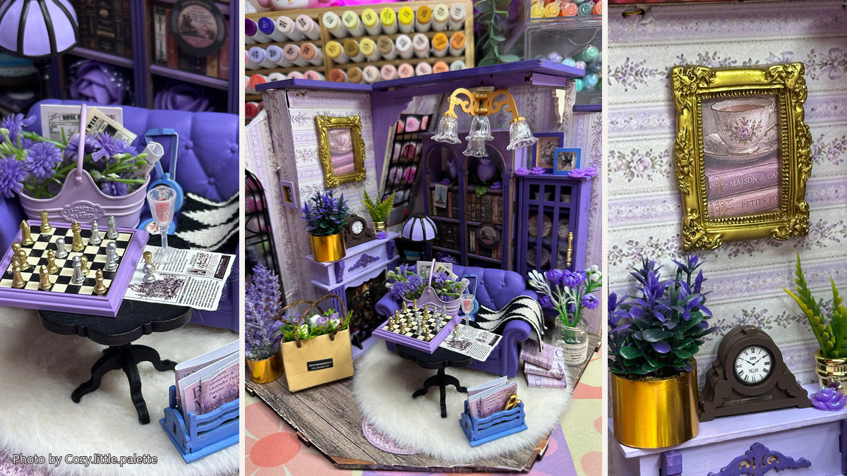
What happens when a miniature room trades its traditional red and brown palette for lavender?
Robotime Community creator Cozy.little.palette explored that question with the Rolife Catherine’s Living Room DG175. Using acrylic markers, added flowers, miniature accessories and a favorite color, she shifted the room from classic Victorian warmth toward a softer, more personal retreat.
The architecture is still recognizable: the arched window, fireplace, bookcases, chandelier and chess table remain. Yet the atmosphere has changed completely. Her project shows that a strong customization does not always require rebuilding the structure. Sometimes, the most convincing transformation begins with a clear feeling and a palette disciplined enough to carry it through.
Begin with the way the room should feel
Lavender was not an arbitrary styling choice. It is Cozy.little.palette’s favorite color, and she associates it with calm and comfort. Her goal was to create the kind of small escape where she could imagine curling up with a book, flowers nearby and a warm light on.
That emotional direction gave every later choice a purpose. The purple sofa became the visual anchor. Lighter lilac furniture and accessories softened the surrounding space, while the room’s original cream walls kept the palette from becoming too heavy. Rather than changing color simply for novelty, she used it to describe an imagined experience.

Repeat color with intention
A single purple sofa would read as an accent. Repeating related hues across the room turns that accent into a visual system. Lavender appears in the couch, chessboard frame, flowers, books, lamp shade, cabinet, artwork and small decorative objects. Because the shades vary, the room feels layered rather than uniformly painted.
The chess table is especially effective. Its black-and-white board interrupts the purple field, but the lilac frame connects it to the sofa and the rest of the room. The flower basket does something similar: its muted container sits naturally against the deeper upholstery while the green stems add a small complementary contrast.


Layer texture and scale
Color establishes the first impression, but texture makes the room feel inhabited. A fluffy white rug softens the hard floor and dark table legs. A black-and-white throw adds a graphic pattern to the purple couch. Flowers appear as tall stems, compact bouquets and small shelf accents, allowing the eye to move through the room instead of stopping at one oversized arrangement.
Paper details work at an even smaller scale. Books, magazines and loose pages suggest quiet routines: reading, collecting and leaving something open on the table. These objects support the room’s story because they belong to the life imagined for it. The lesson is not simply to add more accessories, but to mix materials and sizes so each layer performs a different job.


Protect the room’s contrast
A monochrome room can lose definition when every surface competes for the same color. Here, several parts of the original design are allowed to remain visually strong. Dark bookcases frame the lighter furnishings. Black window tracery outlines the room’s edge. Gold frames and planters add warmth, while green leaves keep the floral theme natural rather than purely decorative.
The fireplace wall demonstrates this balance clearly. Pale floral wallpaper, a lavender mantel and purple artwork establish the customized mood, but the dark clock and gold frame still give the composition weight. Preserving those contrasting elements helps the original focal point survive the palette change.


Know when the room is complete
The creator said the hardest part was deciding when to stop. Each time she looked at the room, she found herself thinking, “Wait… one more flower would be cute.” That temptation will feel familiar to many miniature makers: empty space can look like an invitation.
A useful finishing test is to look at the scene from normal display distance. Can the main furniture still be identified immediately? Does each added item strengthen the chosen atmosphere or reveal something about the imagined resident? Are several details competing for the same small focal area? If the room already communicates its mood before the viewer studies the close-ups, the design is probably doing enough.
In this build, the abundance works because the objects share a clear visual language. The repeated lavender hues, floral forms and reading-room details make the additions feel collected rather than random.
Make the palette personal
Cozy.little.palette’s version of Catherine’s Living Room demonstrates how a favorite color can become more than decoration. Used with repetition, material contrast and careful editing, it can reshape the identity of a familiar miniature while leaving its strongest architecture intact.
Explore the original Rolife Catherine’s Living Room DG175, then consider what color, texture or everyday ritual would make the room feel unmistakably yours.

Creative build and photography by Robotime Community member Cozy.little.palette. This project includes personal modifications and additional materials that are not included with the original kit.
See every angle and read the creator’s complete notes in the original Robotime Community post.


Robotime Creative Team
As Robotime's earliest audience and testers, they start from user needs and are dedicated to sharing stories and insights about the brand and its products.
Robotime is a creative lifestyle company dedicated to designing and developing 3D puzzles, toys, and wooden handicrafts. Subscribe to learn more.
Enjoy Robotime building guides and creative inspiration?
Add Robotime as a Preferred Source on Google to see more of our latest stories in Search.
 Add Robotime to your Preferred Sources
Robotime Creative Team
As Robotime's earliest audience and testers, they start from user needs and are dedicated to sharing stories and insights about the brand and its products.
Robotime is a creative lifestyle company dedicated to designing and developing 3D puzzles, toys, and wooden handicrafts. Subscribe to learn more.





Leave a comment
This site is protected by hCaptcha and the hCaptcha Privacy Policy and Terms of Service apply.