




Warm light spills across a tiny bar, catching on glassware, menus and the wheel of an old-fashioned bicycle. Sky-blue chairs gather around white tables, while a teddy bear waits near the entrance as the first guest. The scene feels like a seaside place discovered on holiday rather than a miniature assembled at home.
That atmosphere grew from a deliberate change of direction. Robotime Community maker JDisaduck began with the Rolife Cheers Bar & Dining DIY Miniature House DG173, then softened its original red, orange and yellow palette with sky blue, white and pale wood tones. Custom paper surfaces, new artwork and carefully chosen details gradually turned the room into what she named Ocean Cheers Bar & Dining.
Her project is also a useful example of how a color story can guide practical decisions. Instead of rebuilding everything, she focused on the surfaces that carried the most visual weight, worked in short sessions and kept adjusting the room as the pieces came together.
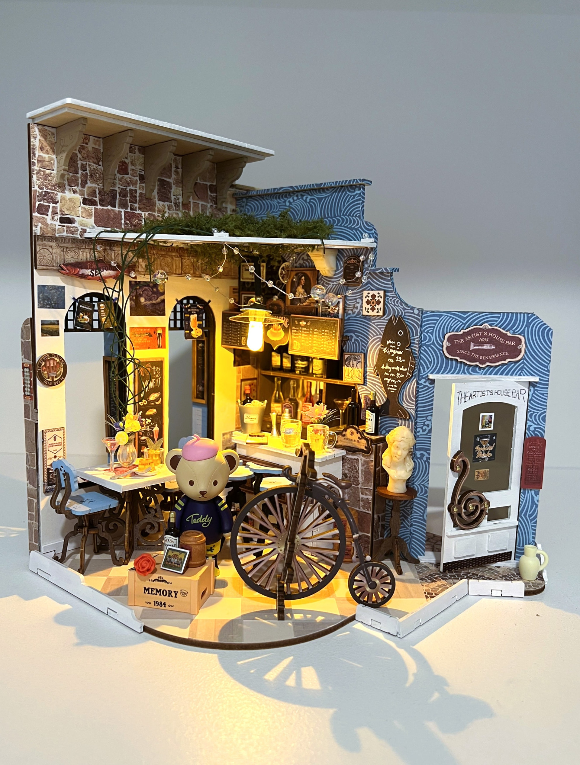
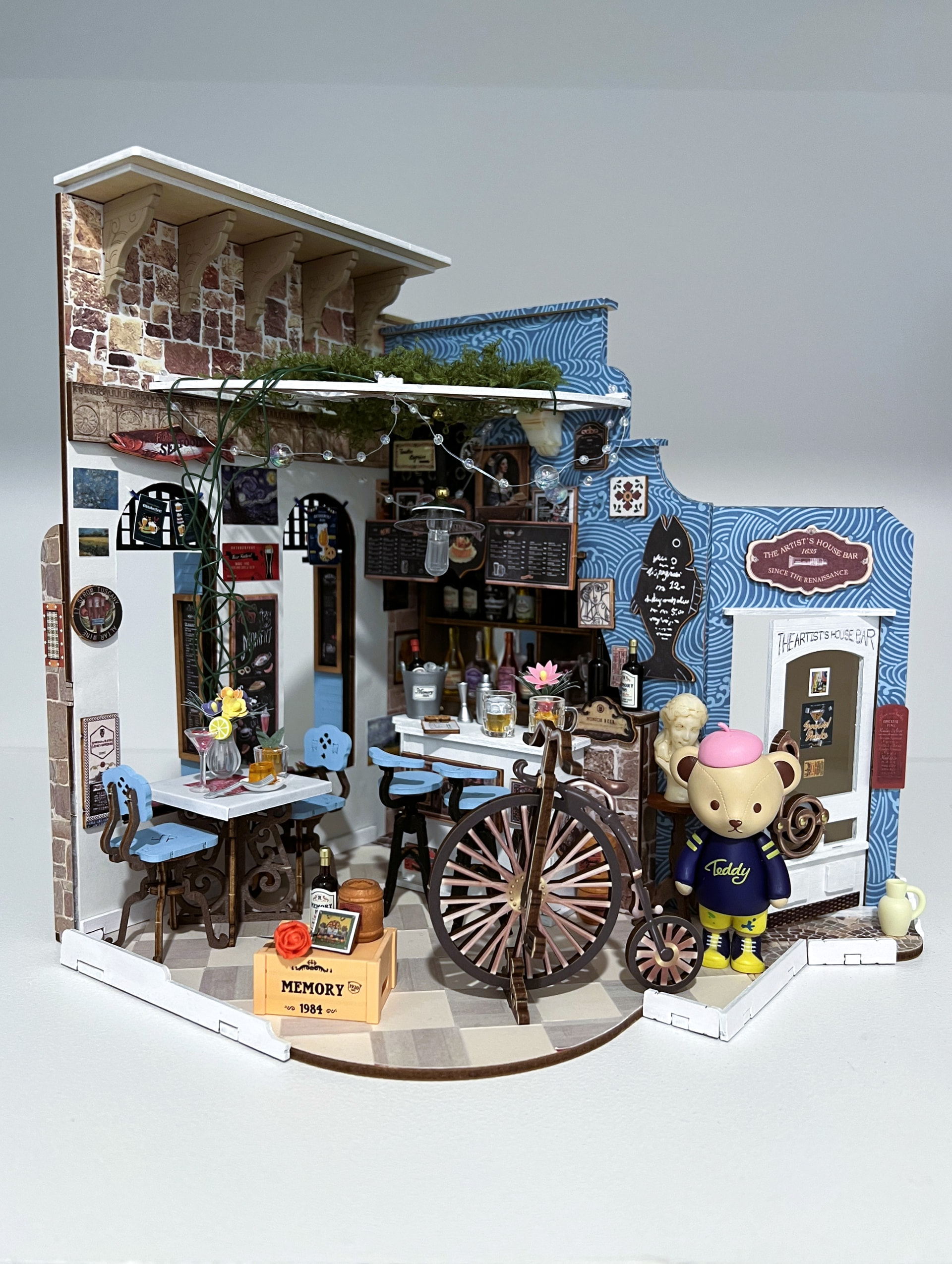
The same finished room feels warmer under its lights and crisper in daylight, revealing how color and illumination work together.
Choose a calmer color story
JDisaduck felt that the original combination of red, orange and yellow was visually heavy, so her first changes established a simpler rule: repeat sky blue and white wherever the eye naturally travels. The chairs and window shutters became blue, while the bar counter and several architectural pieces changed to white.
This worked because she did not treat every part as an isolated painting task. The repeated blue connects furniture to architecture, and the white surfaces give the detailed interior a little breathing room. When a miniature already contains many signs, bottles and accessories, a limited palette can organize them without removing the character that makes the room interesting.
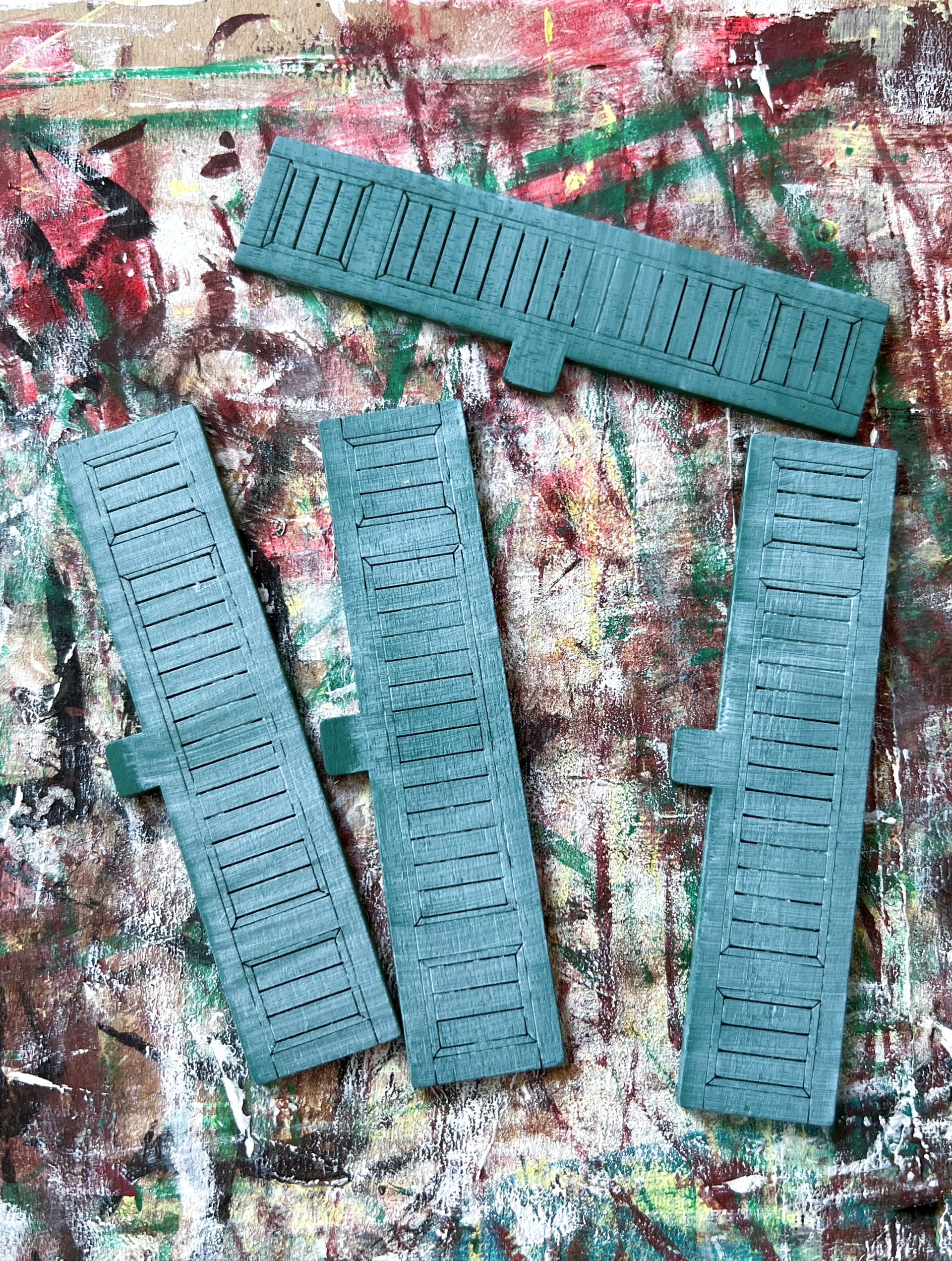

Repeating sky blue and white across different parts established the new palette before the room was assembled.
Turn printed paper into a new floor
The floor became one of the most transformative changes. JDisaduck liked the checkerboard layout of the kit but wanted to remove its red tiles, so she printed a pale wood-board design on paper and cut it into individual squares. She then alternated the direction of the wood grain from tile to tile, preserving the movement of a checkerboard while replacing its color.
The method is accessible because it changes the visible finish without requiring a new wooden base. It also shows why pattern direction matters: alternating horizontal and vertical grain makes adjacent paper squares read as separate tiles. She covered the exposed areas carefully, left original material where furniture would hide it and trimmed the edges after the adhesive dried.
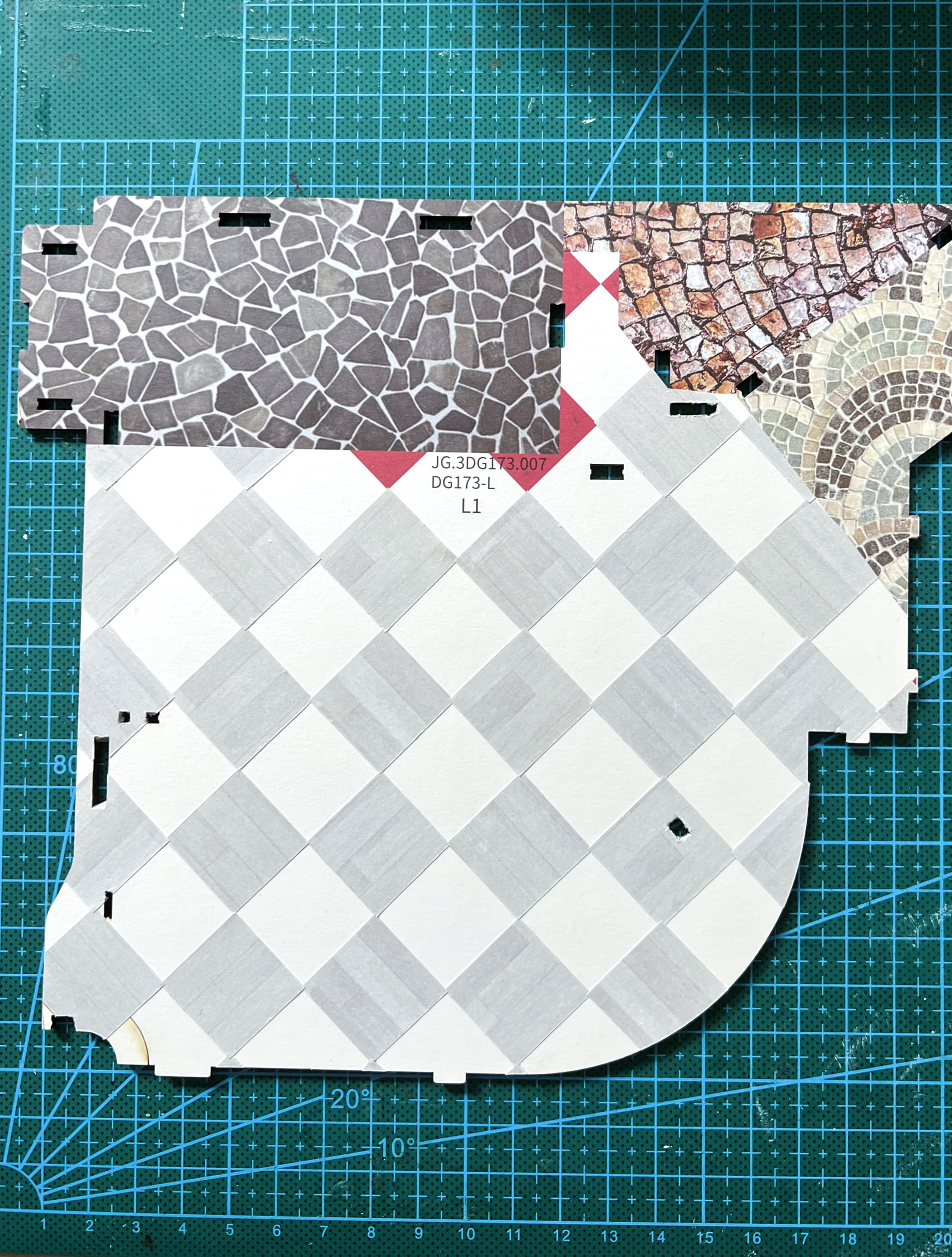
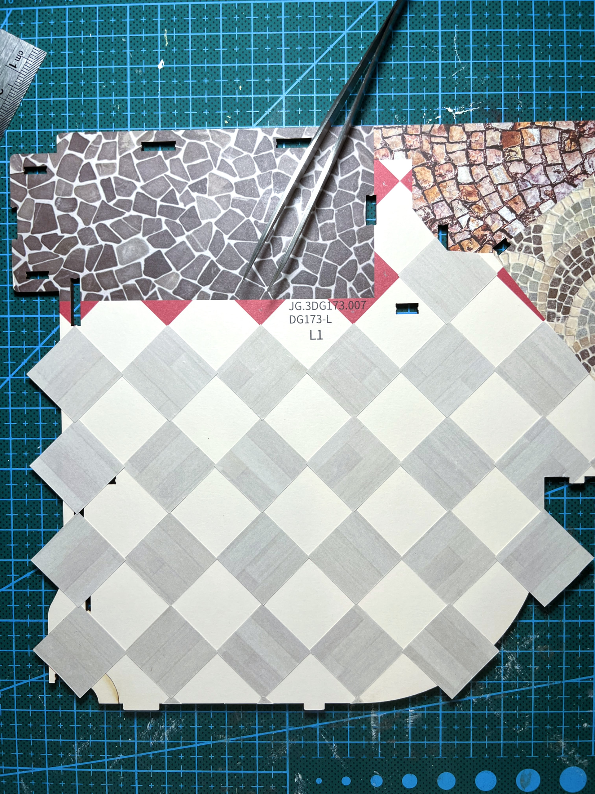
Individual paper squares preserve the checkerboard rhythm while changing both the color and texture of the floor.
Build personality across the walls
Paper also gave the walls a new identity. Blue-and-white origami paper covered the strongest orange areas, while two layers of white paper created a clean surface elsewhere. Because cabinets, windows and decorations would conceal parts of the walls, JDisaduck planned joins around places that would later disappear from view.
Once the larger surfaces were quieter, smaller graphics could carry the story. She replaced selected prints with Van Gogh artworks, added drinks menus above the windows and created more menus for the shutters. Other original artwork remained. That mixture keeps the room connected to the kit while making the finished bar recognizably hers.
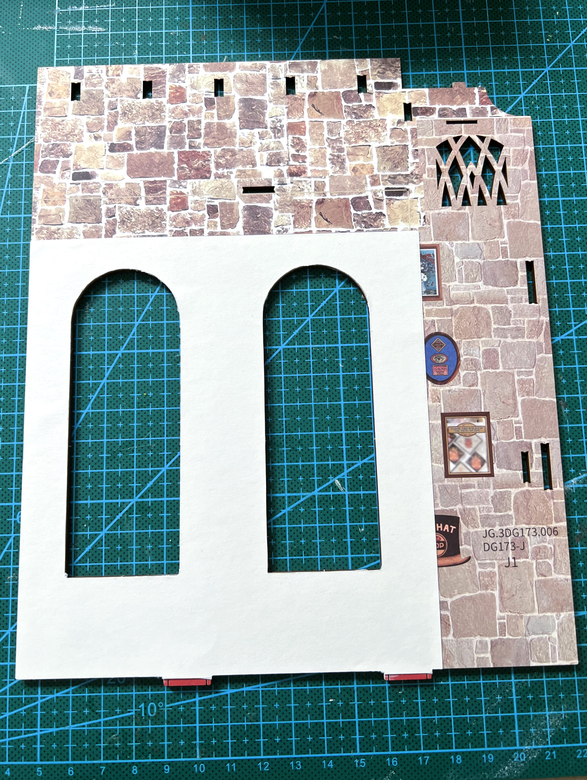

A plain paper layer became a fresh background for custom menus and selected artwork.
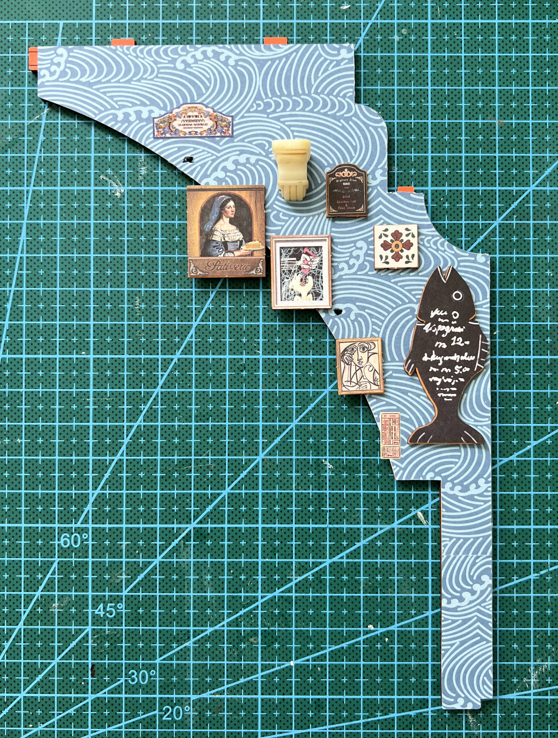
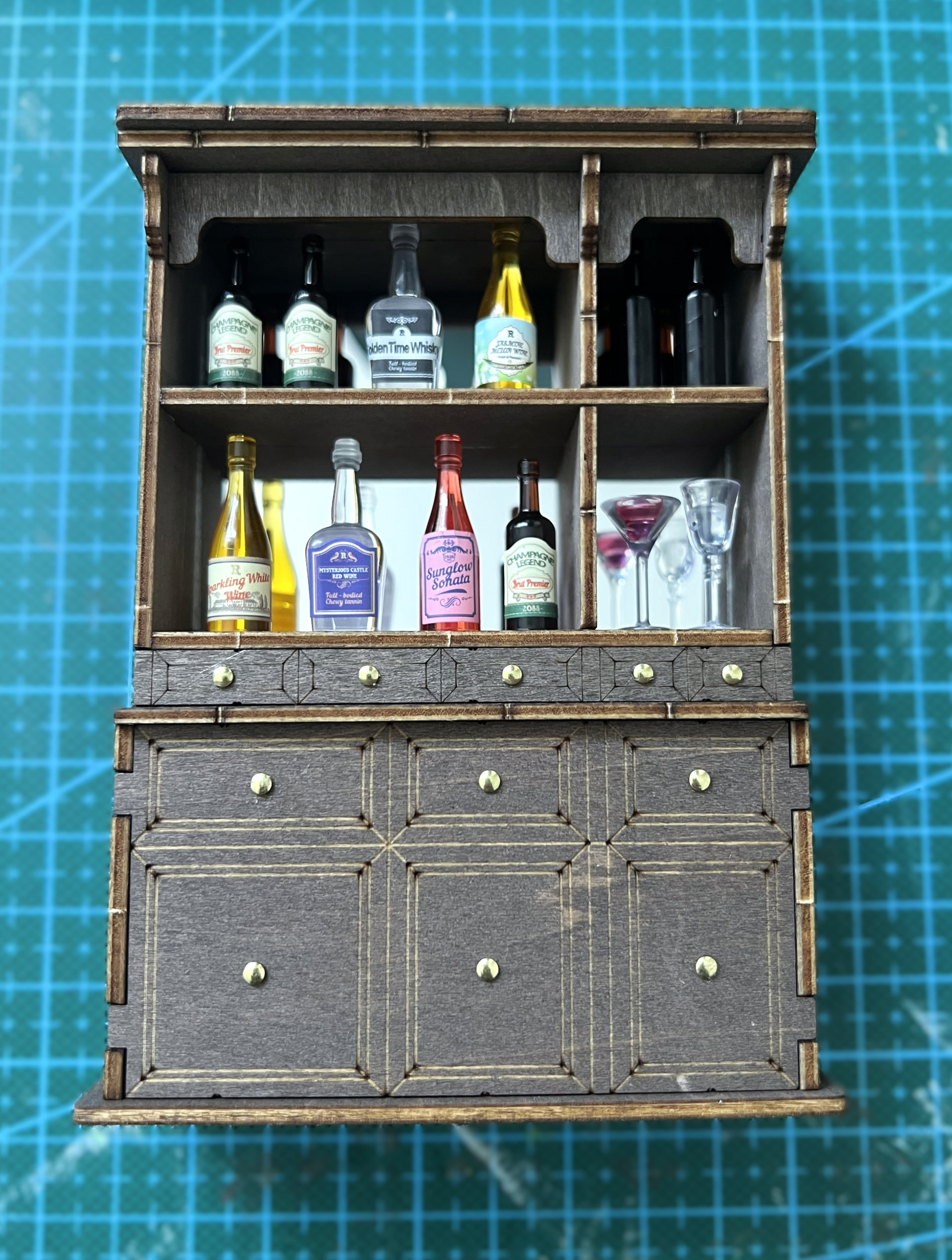
The wave-patterned wall introduces the ocean theme, while the dark drinks cabinet anchors the lighter palette.
Not every decision had to be permanent. JDisaduck initially tried a patterned table covering, decided it made the room too busy and later replaced it with a clean white one. The change is a useful reminder to evaluate a pattern inside the full scene rather than judging it only as a separate material sample.
Check every view before final assembly
Personalizing pieces before assembly can make painting and papering easier, but it introduces a different challenge: a surface that looks hidden when flat may become visible after two walls meet. JDisaduck encountered exactly that problem when she realized an uncovered orange corner could be seen from another angle.
She took the section apart, extended the wallpaper and then reassembled it with the cabinet in place. The practical lesson is simple: temporarily fit adjoining walls, look from the front and both sides, and mark every exposed edge before applying glue permanently. The same check can catch unpainted tabs, roof frames and the backs of parts that become visible through doors or windows.
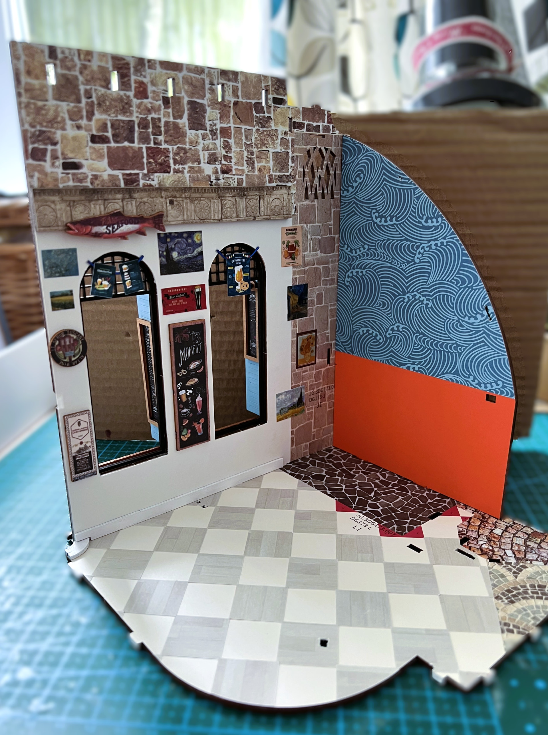
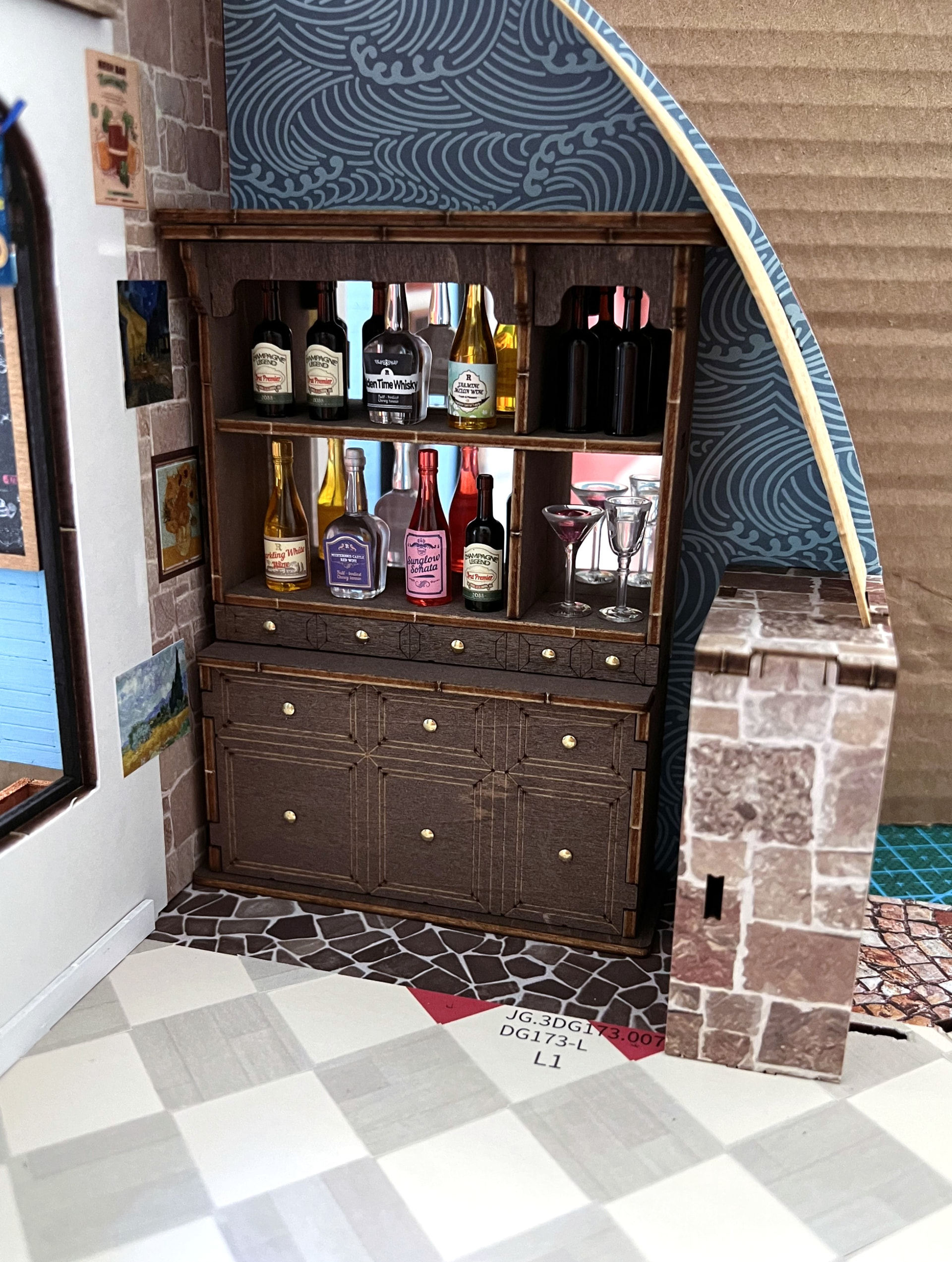
A trial fit revealed a visible orange corner; extending the wallpaper before final assembly produced a cleaner view.
Let contrast and light complete the scene
A personalized palette does not require erasing every original color. JDisaduck left one exterior wall red and liked the contrast it created beside the blue shutters. She described it as a small piece of the model's history—a visible reference to where the transformation began.
Inside, tiny drinks, white tabletops, blue chairs and the teddy bear patron bring the bar to life. When the lights are switched on, warm amber illumination returns some of the coziness of the original palette without overwhelming the blue-and-white surfaces. Photographing or viewing a build both lit and unlit is therefore more than a finishing ritual; it is a final color test.
“I personally think the whole mood changes when the lights are on. The space turns into something much warmer and even more inviting.”
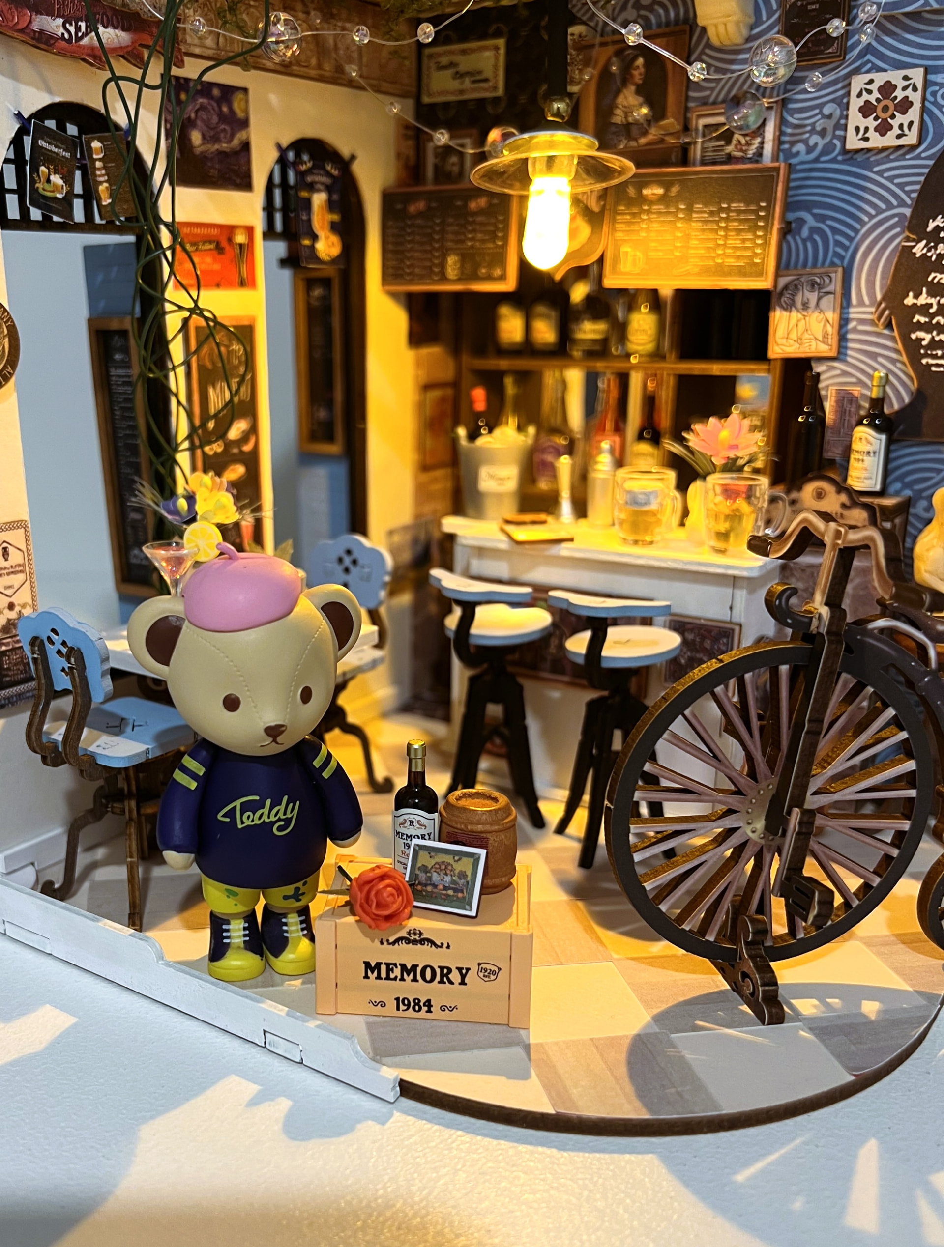
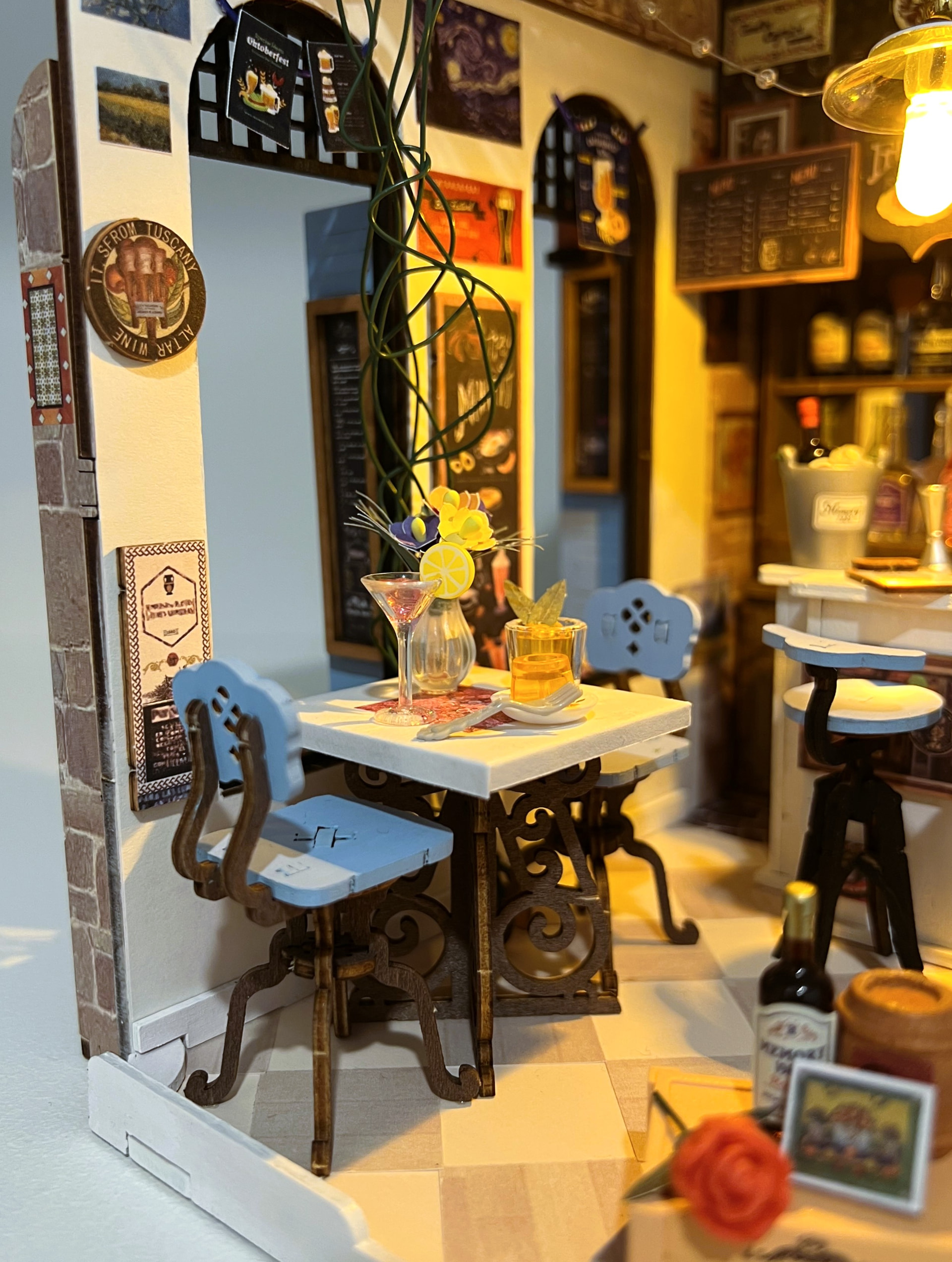
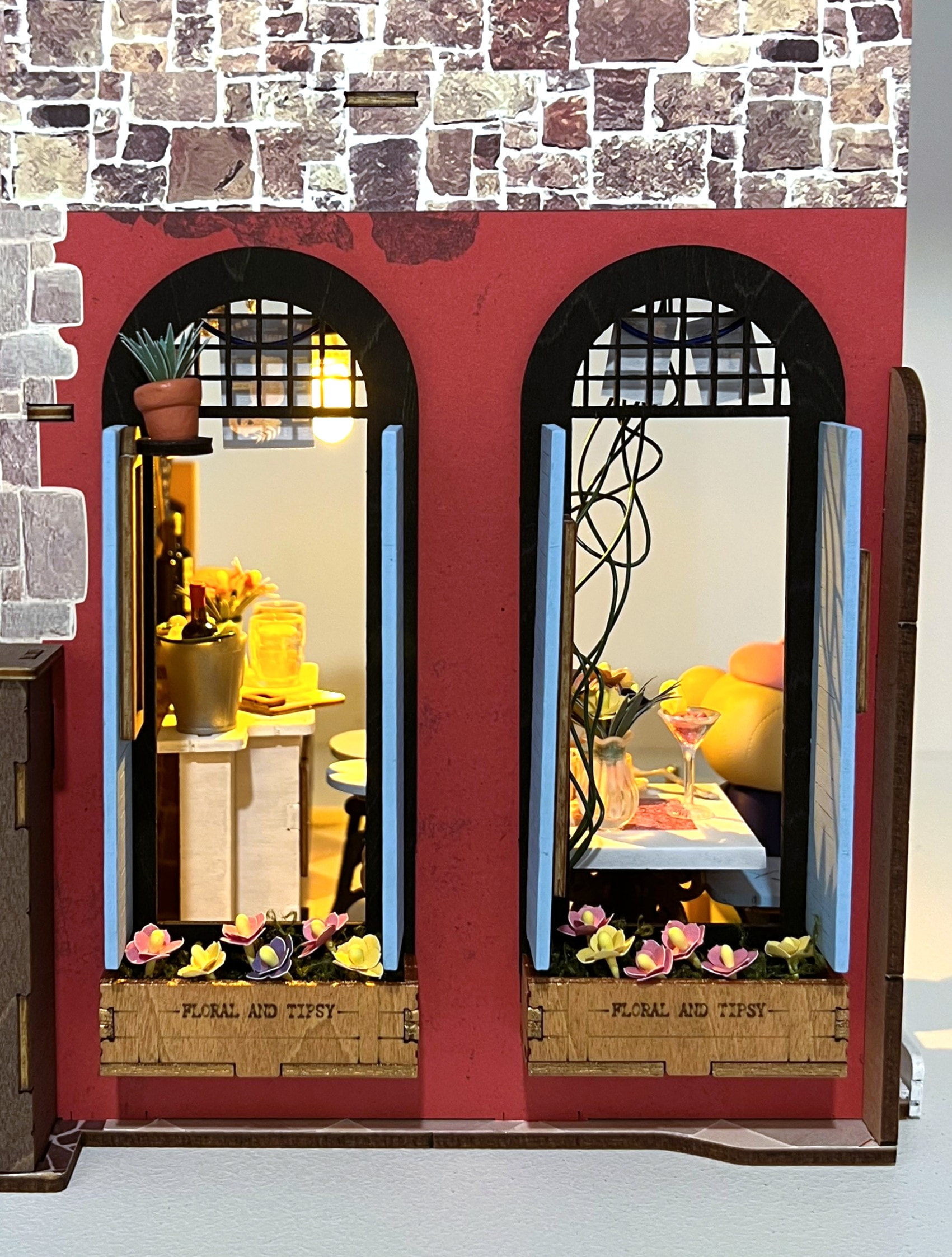
A character, a lit dining corner and the retained red exterior each add a different layer to the finished bar's story.
Ideas to borrow for your own miniature
JDisaduck's project suggests a practical sequence for changing a detailed miniature without losing control of the design:
- Choose two main colors and repeat them across furniture and architecture.
- Change the largest visual surfaces first: floor, walls and prominent counters.
- Use printed paper when it offers a cleaner or more repeatable finish than paint.
- Alternate pattern direction when separate tiles or boards need clearer definition.
- Test decorative papers inside the assembled scene and simplify anything that competes with the details.
- Dry-fit walls and inspect the miniature from every display angle before final gluing.
- Keep an original color where it creates useful contrast or records the starting point.
- Check the completed palette with the lights both on and off.
The project also grew through patience. At one stage, JDisaduck described her progress as about ten minutes a day. Those short sessions were enough to keep the build moving while leaving room to reconsider details such as the table covering and visible wall edges. Customization does not have to happen through one dramatic rebuild; it can emerge through a series of small, connected choices.

Explore the complete progression and additional photographs in JDisaduck's original Robotime Community post.
Creative build and photography by Robotime Community member JDisaduck. This project contains personal modifications and additional materials that are not included with the original Rolife Cheers Bar & Dining kit.


Robotime Creative Team
As Robotime's earliest audience and testers, they start from user needs and are dedicated to sharing stories and insights about the brand and its products.
Robotime is a creative lifestyle company dedicated to designing and developing 3D puzzles, toys, and wooden handicrafts. Subscribe to learn more.
Enjoy Robotime building guides and creative inspiration?
Add Robotime as a Preferred Source on Google to see more of our latest stories in Search.
 Add Robotime to your Preferred Sources
Robotime Creative Team
As Robotime's earliest audience and testers, they start from user needs and are dedicated to sharing stories and insights about the brand and its products.
Robotime is a creative lifestyle company dedicated to designing and developing 3D puzzles, toys, and wooden handicrafts. Subscribe to learn more.




Leave a comment
This site is protected by hCaptcha and the hCaptcha Privacy Policy and Terms of Service apply.